Do It Myself Blog – Glenda Watson Hyatt

Motivational Speaker

Can Your Blog Readers Find Your Hyperlinks?

Filed under: Blog Accessibility — by at 12:05 am on Wednesday, February 25, 2009

In the last web accessibility post, three tips were offered for making the content of hypertext links more usable. Today, consider the appearance of these links.  Can your blog readers easily spot your hyperlinks?

Which example below closest resembles your blog’s links?

Example #1: Links are indicated by colour only

Poorly indicated hyperlinks

In this screen shot, the link is indicated by a change in font colour. What if your readers have colour-blindness or low vision?

Colour should not be the only visual means of conveying information.

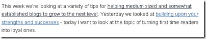
Example #2: Links are faintly underlined

Examples of faintly underlined hyperlinks

Can you spot the hyperlinks? Look closely. There are three of them, faintly underlined.

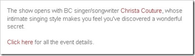
Example #3: Links are camouflaged by other coloured and underlined text

Example of poorly indicated hyperlink

In this screen shot, is the hyperlink the dark blue text, the red text with underline, or the black text with underline? Unless they hover their mouse over the different bits of text, how do your readers know where to click?

Example #4: Links are standard website blue

Hypertext links are blue with blue underline

In this screen shot, the hypertext links are standard website blue with blue underlining. Visited links become black text with black underlining – a nice feature so readers know which links they already followed.

Take a look at the hyperlinks in your blog posts. Are they easy to find? Or, do your readers need to hunt for them?

Additional resources:

If you enjoyed this post, consider buying me a chai tea latte. Thanks kindly.

Random Posts

Trackbacks

18 Comments »

Comment by Ching Ya

February 25, 2009 @ 12:56 am

Most of the times I’ll use blue color for the links, or any that’ll contrast with the text fonts. From the example, #3 are the most catchy one, #4 also not bad. I just may give Underlined a thought as well in future.

Comment by Tim O'Brien

February 25, 2009 @ 4:23 am

Good post here, but I have one thing to point out. Standard website blue does not offer the proper contrast against the typical white back ground of most web pages. Underlining is important, but color schemes should reflect awareness of the need for better contrast.

Comment by Douglas T

February 25, 2009 @ 6:15 am

I realize I’m a web geek, but I really don’t like default blue links. Makes me think that the designer just couldn’t be bothered to pick a color.

Change color, font weight, font style, under or overline effect, background color… pick any two or more of those and you’ve got some identifiable links. If you only use one, they might be blending in too much.

Using hover and focus effects is good too. Let’s viewers verify which link they’re on, before hitting it. Hover for mouse, focus for anybody navigating with their keyboard. Know anybody like that?

Comment by Samantha

February 25, 2009 @ 6:40 am

This is a good reminder. At my job a lot of non-web people control content on the website and get color/underline happy and it creates a lot of confusion. We’ve tried to curb it but a lot of these still slip through. I should also look at my own personal website to see how I’ve set it up. There’s an obvious desire to create something visually appealing but it can definitely work against website usability if it’s not done well or in the interest of the visitor. Thanks!

Comment by Tim O'Brien

February 25, 2009 @ 6:54 am

I find that blue-on-white color scheme of the default blue links on the usual white background very difficult to read. There is not enough contrast. I need to use Firefox’s Accessibar plug-in to change the colors so I can read the link text.

Comment by Glenda

February 25, 2009 @ 10:59 am

Douglas, I like your suggestion of using two methods of indicating a link. One just isn’t enough. Combining hover and focus is great. Although, Interestingly, yesterday I came across this comment, “devices like the iPhone don’t have any concept of “hover” and therefore render the whole no-underline hyperlink fad worse than useless”. Because I don’t have an iPhone to test it myself, I’d be interested in hearing what others have found.

Comment by Glenda

February 25, 2009 @ 11:05 am

Ching Ya,

In example #3, surprisingly, the hyperlinks are the dark blue. The coloured, underlined text is for emphasis. Very misleading, isn’t it?

Comment by Glenda

February 25, 2009 @ 11:21 am

Tim, great point on colour contrast. Thank you.

One question I have is, because blogs require intensive reading, do highly contrasted, underlined links detract from the blog’s readability? Is this perhaps where blogs and static websites may differ? I’d love to hear thoughts on this.

Comment by Glenda

February 25, 2009 @ 11:26 am

Samantha, would giving your people some quick tips perhaps remind them that usability is as equally important, if not more so, than visual appeal? Good luck!

Comment by Douglas T

February 25, 2009 @ 11:45 am

I don’t have an iPhone either, but I’d think that focus would work, even if hover didn’t. Don’t know, I’ll have to corner someone with an iPhone and check.

Going in search of an iPhone…

Comment by Douglas T

February 25, 2009 @ 11:57 am

They are correct, a site’s hover and focus effects don’t really work on an iPhone. If you’ve zoomed way in on a page, there is a hover-like effect, but that seemed to be controlled by the browser, not by the site’s CSS. A page’s focus can be set by clicking on a link and hitting back for instance, but the focus never really moved once set, so wasn’t helpful for navigation. It didn’t seem to have any equivalent to keyboard navigation on a PC that would allow focus to be controlled.

Learn something new every day… Probably forget something old too, but let’s not go there.

Comment by G F Mueden

February 25, 2009 @ 2:54 pm

There is an old, crude expression that applies: “If you love me Baby, make me know it”. The same goes here. However you do it, make it obvious. Don’t be cute, show it. Don’t let your tendency to be clever interfere with getting the message across. Hover should only be used to confirm that this is it.
===gm===

Comment by Glenda

February 25, 2009 @ 5:19 pm

Douglas, thank you for snafu-ing an iPod for checking the affects of hover and focus. Sounds the appearance of hyperlinks is the best way to indicate them. Concur?

Comment by Glenda

February 25, 2009 @ 5:24 pm

G F Mueden, great expression! A good one to keep in mind.

Comment by Tim O'Brien

February 25, 2009 @ 6:19 pm

1. IPhone

The iPhone has its version of hover. I have a Touch, which is the iPhone without the phone.If you touch and hold your finger on a link, a short description pops up. I do not think many people know about this feature.

2. Alternate Color Schemes

Using alternate color schemes (like your own CSS or Accessibar) may mean that using link colors alone is not accessible. Multiple methods would avoid this issue. I use Accessibar to force a gold-on-black color scheme on most web sites. So I would miss links solely indicated by color.

Comment by Douglas T

February 26, 2009 @ 4:00 am

With the iPhone, you definitely need to identify the links clearly. With the small screen, the more subtle link identifiers would be no help. While it has it’s own version of hover as mentioned above, this isn’t an instant effect, you have to hold for a second. It’s not going to help identify links as someone scans over a page.

Are other mobile web devices like this? Anyone?

Comment by Tim O'Brien

February 26, 2009 @ 5:44 am

Douglas is correct. It was past my bedtime when I wrote that up, so it did not come out the way I meant.

In general, more and more wevsites are coming out with mobile-device friendly versions of their sites. I think that clear and simple color schemes with obvious visual indicators is fairly standard from what I have seen. I do not normally use them on my iPod Touch. Most mobile web pages, for some dumb reason, have the multitouch zoom feature disabled. The zoom is a key accessibility feature for me. (I go into detail about iPhone accessibility features here: http://www.timobrienphotos.com/large-print-ideas/iphone-access/.)

Does anyone use a alternate color scheme when browsing?

Comment by Tim OBrien

February 28, 2009 @ 6:48 am

The other night, I posted that message too much after lights out.

Douglas is completely right about the iPhone hover. In practice it is not a useful link indicator.

The important thing, then, to take away from all this is that all links should have consistent, obvious and multiple indicators.

A different color combined with underline is standard. But this needs to be put into the context of the formatting used on the rest of the page. If the other text has several different colors and uses other text formatting liberally, using standard indicators will not be sufficient.

The indicators should be consistent, if not with the rest of the net, then within that page. Users will not find links if each has a different uniform.

RSS feed for comments on this post. TrackBack URI

Leave a comment

XHTML: You can use these tags: <a href="" title=""> <abbr title=""> <acronym title=""> <b> <blockquote cite=""> <cite> <code> <del datetime=""> <em> <i> <q cite=""> <s> <strike> <strong>