Do It Myself Blog – Glenda Watson Hyatt

Motivational Speaker

Colour Your Blog to Maximize Readability

Filed under: Blog Accessibility — by at 3:17 pm on Thursday, April 8, 2010

In the earlier post 5 Ways to Increase the Accessibility of Blogs, tip #3 is to maximize colour contrast to enhance readability for individuals who are colour blind or has low vision, as well as those of us with aging eyes.

But, how do you measure colour contrast? How much contrast is sufficient?

My favourite colour analyzer, so far, is the Colour Contrast Analyzer application available on the Web Accessibility Toolbar:
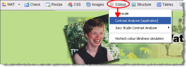
Web Accessibility Toolbar with the colour contrast analyzer application

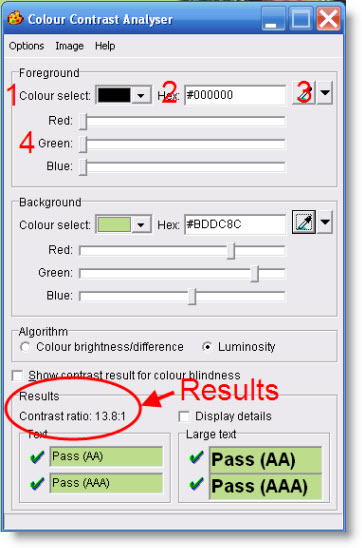
Using this handy application, the contrast between a foreground colour and a background colour can be tested one of four ways, depending upon the information available:

  1. Select the colour from a drop down box,
  2. Enter the HEX code,
  3. Use the eyedropper to choose a colour from the webpage or anywhere, or
  4. Use the red-green-blue sliders.

Screen shot of the colour contrast analyzer

The results are immediately given as either a pass or fail, in accordance with the Web Content Accessibility Guidelines 2.0, which requires a contrast ratio of 4.5:1 (with a few exceptions).

To my understanding, the Web Accessibility Toolbar is only available for the Internet Explorer (IE) browser. (Please correct me if I’m wrong here.)

However, once the Colour Contrast Application is open and even IE closed, the application can be used in other browsers and programs; for example, in word documents to test the contrast between the heading colour and the background colour.

While researching this morning for a few other related posts and projects, I came across a list of other colour analyzing resources, which I’m working my way through:

Which resources would you add the list? What is your favourite colour analyzer tool?


For more tips on enhancing your blog, download the free ebook How POUR is Your Blog?: Tips for Increasing Your Blog Accessibility.

If you enjoyed this post, consider buying me a chai tea latte. Thanks kindly.

Random Posts

Trackbacks

13 Comments »

Comment by Suzie Cheel

April 8, 2010 @ 4:47 pm

Great post Glenda- going to check out some of the links

Comment by Ricky Buchanan

April 8, 2010 @ 6:23 pm

Note: Contrast can be TOO high for some people. Those with some types of Dyslexia, especially, deal really badly with pure white on pure black or pure black on pure white levels of contrast. I believe there’s an article or mailing list thread archive on WebAIM from last year discussing a recommended contrast range to stay within.

r

Comment by Glenda

April 9, 2010 @ 12:38 am

Great point, Ricky! I’m curious to know what that contrast range is. Is it possible to find the right balance for all of the disability sets? 😉

Comment by Richard

April 9, 2010 @ 2:07 am

There is a newer version of the contrast analyser available at Colour Contrast Analyser but it does still have the same bug regarding the level required to pass (it’s there because the requirement changed from 5.0 to 4.5 very late in the drafting of WCAG 2.0). It also runs independently of the browser.

Comment by steve faulkner

April 9, 2010 @ 6:10 am

hi glenda, the version of the color contrast analyser (CCA) you are using from the (WAT) web accessibility toolbar is quite old,as the AIS toolbar is quite old. I developed it while working at vision australia. Work on the toolbar has continued at the paciello group and the latest 2.0 version is available in the current version of the WAT the latest version of the CCA available also as a seperate download, does use the correct ratio 4.5:1. there are version for both windows and Mac.

Comment by Glenda

April 9, 2010 @ 3:12 pm

Thanks Richard and Steve for correcting me on the status of the Web Accessibility Toolbar. Off to download the new version now.

Comment by Glenda

April 9, 2010 @ 7:21 pm

Steve, poking around the Web Accessibility Toolbar 2.0, I like the GIF Flicker Test! It confirms my suspicions about a few sites having the potential to cause seizures.

Comment by Cheryl

April 10, 2010 @ 9:55 am

very timely post as I’m a new paid webmaster onourownbalto.blogspot.com and I’m trying to figure out what the background should be. Any ideas? The header has to stay white b/c the logo background is white and otherwise I think it would be odd, but I’m open to suggestions. Or should I keep the whole thing white? Is it too plain?

Comment by Glenda

April 10, 2010 @ 2:03 pm

Cheryl, congrats on your new paying gig!

Taking a quick look at the site, I like the clean, crisp, open look of your sit. Personally I’m feeling too confined with my current design; too narrow. With yours being all white, it feels more open.

Although, as Ricky mentioned, black on white may be too stark or too much glare for some individuals. Perhaps the dark gray (#3333333) for the text or the pale cream (#ffffcc)for the background would help.

But, I’m no designer, so that may not be the best advice! 😉

Comment by Cliff Tyllick

April 13, 2010 @ 2:40 pm

Glenda, in my previous comment I forgot to mention that there is no color contrast that is perfect for everyone. Some color combinations preferred by people who have moderate low vision have too little contrast to conform with WCAG 2.0.

I think the best course of action is to meet the minimum guideline (at level AAA, 4.5:1 for large text and 7:1 for small text), but not really shoot for the highest values possible, with an aesthetically pleasing color combination.

Comment by Isha

April 15, 2010 @ 2:56 pm

Do you know of any similar toolbars/plugins for Chrome or for Firefox Glenda? I’ve had to give up on IE because it constantly stalled my Windows 😮 [eek]

Comment by Isha

April 15, 2010 @ 2:59 pm

Lol I think Richard answered my question above! 😀

Comment by Jeremiah Ramirez

July 9, 2010 @ 8:48 am

Tom Cruise have dyslexia and yet he is still a very successful actor.*,:

RSS feed for comments on this post. TrackBack URI

Leave a comment

XHTML: You can use these tags: <a href="" title=""> <abbr title=""> <acronym title=""> <b> <blockquote cite=""> <cite> <code> <del datetime=""> <em> <i> <q cite=""> <s> <strike> <strong>