Do It Myself Blog – Glenda Watson Hyatt

Motivational Speaker

5 Ways to Increase the Accessibility of Blogs

Filed under: Accessibility 100,Blog Accessibility,Blogging,Living with a disability — by at 1:15 am on Thursday, June 5, 2008

Accessibility 100

Blogs create a way for people to share their thoughts, pass on information and connect with others from around the world. Blogs provide countless individuals with a door to the world. However, for many individuals, blogs slam shut that door by creating as much of a barrier as stairs do for wheelchair users in the brick-n-mortar world.

Within the confines of their blogging platform, there are ways bloggers can increase accessibility for people with some kinds of disabilities.

1. Provide ALT attributes for all images

Images present problems for people with sight impairments using screen readers – software that reads aloud what is displayed on the computer screen. This technology cannot read content presented in an image or graphic format. Also, individuals with older computers or slow Internet connections may surf with image loading turned off and will miss information presented visually.

The simple solution is providing text equivalents for all images and graphics. In HTML, this is the ALT attribute. The code for inserting an image would look like:

<…img src=”http://www.xxx.com/logo.jpg” alt=”Accessibility 100″ />

Individuals not able to see the image would hear or read “Accessibility 100”. They receive equivalent information.

In WordPress (version 2.5.1), when using the “Add an image” feature, filling in the caption field provides the ALT attribute:


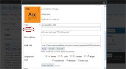
Screen shot of the “Add an image” dialogue box

Other blogging platforms will vary in how the ALT attribute is inserted. For bloggers comfortable with HTML, the platform may allow them to insert the attribute manually.

When writing ALT text, consider:

  • ALT text must communicate the purpose of a graphic accurately and succinctly.
  • the length of ALT in relation to image size (rule of thumb: 150 characters maximum),
  • if the image is purely eye candy, in which case the null ALT is appropriate. Without an ALT present, even a null one, an individual using a screen reader would hear “image”.

Not using images is not a solution. Images can increase comprehension and usability for others.

2. Make hypertext informative

Like sighted individuals, people using screen readers often scan a webpage for hypertext links that may interest them. Links like “click here” or “more” make no sense when read out of context.

To increase the accessibility of your blog, make hypertext links informative when read out of context, whether they are on their own or as part of a sequence of links. Make link text succinct.

For example, instead of:

Listen in on the interview here.

Try:

Listen to the interview.

Instead of:

…running two Group Research projects… (where each hyperlinked word points to a separate link)

Try:

…running the Internet Marketing Group Research Project and the Community Building Group Research Project

3. Maximize colour contrast

Screen shot demonstrating poor colour contrast

Blogs entails countless hours of reading. Enhance readability by maximizing contrast between text and background colours.

Consider these suggestions when choosing colour schemes:

  • Black on white is the most legible; white on black is reasonably legible; other colours on black are less legible.
  • Mixing yellow and black is fairly legible.
  • If using red or green text, make it large and bold enough to be legible in yellow.
  • Black on red and black on green are not legible, as some people will see them as black on black.
  • Combining blue and black is legible enough as long as it is not used for fine detail (e.g., paragraph text).
  • Combinations such as red-blue, green-yellow, green-white, green-gray are poor.

Colour blindness and the web will be discussed further in a future Accessibility 100 post.

4. Provide text transcripts

Audio and video add another dimension to blogs. These mediums benefit individuals with some kinds of disabilities, such as learning disabilities or cognitive impairments, who find reading long pieces of text difficult and laborious.

However, for individuals who are Deaf or hard of hearing and those who don’t understand the speaker’s accent (we all have accents!), this content is inaccessible to them. (Also, audio content is not yet searchable by search engines.)

The solution is to provide a transcript for all audio and captioning for video. Darrell Hyatt does an excellent job of providing transcripts for his podcasts. (Perhaps, in a future podcast, he’ll describe his process for using the voice recognition software Dragon Naturally Speaking for creating the transcripts.)

5. Avoid CAPTCHAs

Bloggers are inundated with spam comments. CAPTCHAs – Completely Automated Public Turing test to tell Computers and Humans Apart – are frequently used to weed out spambot comments from human comments.

a screen shot of a CAPTCHA

However, because CAPTCHAs are typically images of distorted characters, this information is not accessible to screen readers, leaving people who are blind unable to post a comment. As Darrell Shandrow, a screen reader user, said visual CAPTCHAs are “no blind people allowed” signs.

CAPTCHAs do not keep out only people who are blind. With the distortion of characters or extraneous markings, people with learning disabilities, particularly dyslexia, can have difficulty deciphering what the actual characters are. Likewise, with poor colour contrast, those individuals with colour blindness or low vision can also have difficulty getting past the CAPTCHA step.

One solution is to a combination of visual and audio CAPTCHAs. But, then people who are deaf-blind are excluded.

Avoid using CAPTCHAs, where possible, to moderate blog comments. Instead, use Askimet or other spam filters to control that unwanted spam. Make it as easy as possible to participate in your blog’s community.

Additional resources

For more information on web accessibility, check out these resources:


Accessibility 100 is a series of 100 easy-to-implement, free and inexpensive tips for improving accessibility for people with disabilities. This is a community project. Feel free to leave your comments, questions and ideas for future Accessibility 100 posts.

Get the entire series by subscribing to this blog by filling in the form in the upper right corner or by subscribing to the RSS feed.

If you enjoyed this post, consider buying me a chai tea latte. Thanks kindly.

Related Posts

Trackbacks

  1. » 5 Ways to Increase the Accessibility of Blogs
  2. DeafPulse.com - the one-stop pulse for all Deaf-related news and blogs.
  3. Is Your Blog Accessible?
  4. Do It Myself Blog - Glenda Watson Hyatt » Are Negative CAPTCHAs Any More Accessible?
  5. Web Accessibility Tips by Left Thumb Blogger
  6. How to get more comments on your blog | Socialbrite
  7. How to make social media ‘wheelchair accessible’ | Socialbrite
  8. Do It Myself Blog – Glenda Watson Hyatt » Colour Your Blog to Maximize Readability
  9. I Read Captions. Don’t we all? « Candy

21 Comments »

Comment by Joanna Young

June 5, 2008 @ 2:45 am

This is excellent stuff Glenda, thank you.

I’d find it useful to know how to do a transcript from a podcast – is there a free or low cost way to do this?

Joanna

Comment by Darren Daz Cox

June 5, 2008 @ 3:18 am

I want to be fair to all the people who happen across my art blog, but I don’t think it’s possible to describe my paintings in the alt tags to any degree other basic generalities. “it’s a girl standing next to a pegasus drawn in charcoal” I could do that but does it really matter in my case?

Would the sight impaired bother to go to my art blog in the first place?

Comment by Karen Putz/ DeafMom

June 5, 2008 @ 5:21 am

Glenda, I’m learning something new from you all the time on this series. 🙂

Comment by Avril

June 5, 2008 @ 7:51 am

This is great, Glenda! I’m going to send it to some of my contacts in the dialogue universe who use blogs on their websites.

Comment by Karen Lynn

June 5, 2008 @ 8:37 am

Hi Glenda,
This is very informative information. I would very much like to chat with you about learning some of this material and other questions I have.

I have C.P. and wrote to you almost a year ago asking you some pertinent questions about your published book, and all I got was this link to your site and no reply.

It sure would be nice to talk or chat with you online about many questions I have which I think you might be able to answer.

Your blog is truly wonderful and has much useful information. I do hope you will take the time to reply personally at your earliest convenience.

Looking forward to your response…

Comment by Marjolein Katsma

June 5, 2008 @ 10:45 am

Great post again, Glenda!

I have some minor quibbles and additional tips though:

1. Re: Maximize colour contrast:
You start out by saying “Black on white is the most legible; white on black is reasonably legible” but black on white and white on black are not about color contrast, they are brightness contrast, which is something different. More importantly, black on white is not “most legible” for everyone: maximizing brightness contrast is actually something to be avoided. There should be a minimum level of contrast, but maximizing it will actually make text hard or very tiring to read for people with certain vision problems. A better approach is to actually avoid the maximum contrast of black on white (an white on black) and use black on a light pastel or light grey background – that will provide sufficient contrast for nearly everyone while avoiding the too-high contrast that can make text actually hard to read. There’s a reason there are browser plugins that do nothing but disable the white background of web pages!

As to actual color contrast, again this has to be sufficient but “maximum” might cause problems as well. the FAE toolbar (see below) has a check built in; another good tool to check is the Juicy Studio Colour Contrast Analyser.

2. Re: Avoid CAPTCHAs I couldn’t agree more, but the article you link to suggests no good alternatives are available. Actually, there are. There’s a whole range of options, and you can use mix-and-match with them. One of the best ones is variously known as “negative captcha” or “gotcha”: rather than asking humans to prove they are not bots, it trips up bots and causes them to prove they are bots, by providing a field (hidden by a stylesheet) that should not be filled in (or have its content not changed). Most bots tend to fill in every field, so they will trip over themselves here – while humans don’t need to do anything at all.

3. Finally, re: your Additional resources: the Web Accessibility Toolbar mentioned there is mostly aimed at developers; unfortunately, most developers don’t use Internet Explorer for development (at most, during a final testing phase) — and this toolbar is for IE only although nowhere on the page this is actually specified. Not to worry, there are several good accessibility toolbars for Firefox (etc.) too – see my two blog posts WAVE toolbar released and FAE: More toolbar goodness. The WAVE toolbar is not only very useful, but also already compatible with upcoming Firefox version 3; the FAE toolbar isn’t compatible with Fx3 yet, and a little buggy but otherwise quite useful. And of course Chris Pederick’s Web Developer toolbar has a lot of tools useful for accessibility testing as well.

Keep up the good work with your series – I’m already looking forward to the next installment!

Comment by Glenda

June 5, 2008 @ 12:08 pm

Joanna, Darrell mentioned he would share his process for creating a transcript in this month’s podcast. I’ll ask him if a free or inexpensive method exists.

Darren, good point. Sight impairments vary in degree; it doesn’t necessarily mean complete loss of vision. An art lover who then loss some vision may, indeed, enjoy your blog. I will look into this further. Sounds like a good follow-up Accessibility 100 post!

Thanks Karen and Avril, much appreciated.

Karen Lynn, thanks for your kind words. I’ll email you shortly.

Marjolein, wow, thanks for your detailed! Yes, colour contrast is a little more complicated than what I shared in this post – I was aiming for simple for now. Colour will be covered in more detail in a future post. And, thanks for the tip on gotchas. I hadn’t heard of those.

Comment by Jana

June 13, 2008 @ 10:26 pm

I tried the ALT descriptions on my pics today, and guess what… THEY WORKED!!!!!!! AND it was so easy… I didn’t realize it, but blogger already has the alt”” in the code, all you have to do is type the description between the quotation marks!!!!

THANKS SO MUCH!!!!! My friend Alison, who is blind and reads my blog sometimes, will be so surprised when she visits me the next time!!!!!!!!!!!

Comment by Glenda

June 19, 2008 @ 5:20 pm

Jana, that’s great! Thanks for letting me know how Blogger handles ALTs. I’m curious to hear how the other blogging platforms work. Let us know what Alison says.

Comment by Martha

July 11, 2008 @ 9:09 pm

Great post. I work for a client who is likely to be developing more blogs for outreach, and who must be as accessible as possible. Thanks for laying this out so well.

Comment by dani

June 17, 2009 @ 7:01 pm

Glenda,
WCAG 2.0 said labels should be placed on the left of input fields. And labels for radiobuttons or checkboxes are on the right of it.
But, common WordPress themes put the label on the right. What do you think based on your experiences?

Comment by Glenda

July 22, 2009 @ 4:57 pm

Dani, good point. The problem is that many theme designers lack knowledge in web accessibility, thus not many themes are accessible. If you do come across truly accessible themes, please let me know.

RSS feed for comments on this post. TrackBack URI

Leave a comment

XHTML: You can use these tags: <a href="" title=""> <abbr title=""> <acronym title=""> <b> <blockquote cite=""> <cite> <code> <del datetime=""> <em> <i> <q cite=""> <s> <strike> <strong>