Do It Myself Blog – Glenda Watson Hyatt

Motivational Speaker

WordPress 2.7: A Brief Accessibility Review

Filed under: Blog Accessibility,Blogging — by at 10:52 pm on Wednesday, January 14, 2009

The past couple of weeks, Darrell and I have been giving his website an extreme makeover (no link because it isn’t quite ready). We have been using WordPress 2.7, which has given me the opportunity to get a feel for it before upgrading WordPress on my own blog.

In the short time I have been using the latest version of WordPress, I have discovered a few issues that can easily be remedied to further increase the accessibility of the most popular blogging platform. 

Colour Contrast

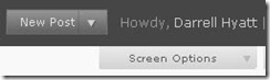
After the initial disoriented feeling of a completely redesigned dashboard (main controls page), the first thing that struck me was the colours. They are rather subdued, without much distinction.

Pulling out the colour contrast analyzer on the nifty Web Accessibility Toolbar, I tested several of the colour combinations on the page. Some did not pass the contrast test necessary for enhancing readability.

Samples of the colour combinations used in WordPress 2.7

With some digging, I found the option for changing the colour scheme (Users > Your Profile > Personal Options):

WordPress 2.7 offers two colour schemes - blue and gray

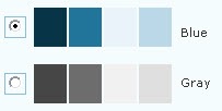
Switching to the blue scheme does more easily distinguish the various sections. However, some of the colour combinations still do not maximize colour contrast to enhance readability.

With such a customizable dashboard, the option for bloggers to choose their own colour scheme to suit their particular needs and tastes would further increase and improve the customization of WordPress.

Keyboard Shortcuts

Poking around further, I discovered keyboard shortcuts had been added to the visual editor used for writing posts. For someone who relies on the keyboard, these shortcuts makes life easier.

Searching the help, I could not find a list of available keyboard shortcuts, except the ones for comment moderation. Unless I have missed something, the only way to discover the shortcuts is to hover the mouse over editor buttons, which defeats the whole purpose of keyboard shortcuts.

The keyboard shortcut for bold

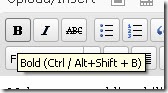
The keyboard shortcut for Bold is given as Ctrl / Alt + Shift + B. I have never seen a “/” in a keyboard shortcut before. What does it mean? Do I actually hit “/”? Does it mean either the Ctrl or the Alt? I could not figure it out for the life of me. Out of sheer frustration, I tried the Bold shortcut that most other PC programs use: Ctrl + B. It worked! The standard Ctrl + I worked for Italic.

No keyboard shortcut shown for underline button
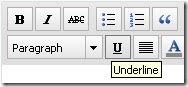
Although a keyboard shortcut is strangely not given for Underline, the standard shortcut does work: Ctrl + U.

A list of functioning keyboard shortcuts available in WordPress 2.7 would be helpful. Even sweeter would be if that list was visible while writing a post.

Images

After upgrading my blog to WordPress 2.5.1 a while ago and being baffled by the “Add an Image” dialog box, I was hoping the 2.7 version would be more straightforward. No such luck. They are essentially the same.

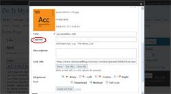
When I uploaded an image for test purposes, the 2.7 version showed the full image (rather than a scaled size, completely messing up the rest of the box:

A screen shot of a portion of the "Add an Image" dialog box

Screen shot of the "Add an Image" dialog box in WordPress 2.5.1 
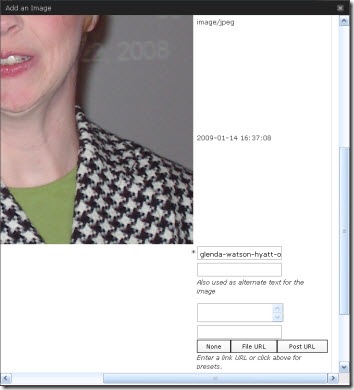
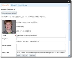
Using the 2.5.1 version for guidance, I am assuming the three text boxes are for entering the Title, Caption and Description. From here, the Title, whose default is the filename, becomes the image title; the Caption becomes the alterative text <ALT>; and the Description seems to disappear and is pointless. Confused yet? I am!

The code comes out as:

<img src=”http://enablingabilities.com/wp-content/uploads/2009/01/glenda-watson-hyatt-oct08.jpg” alt=”Glenda Watson Hyatt” title=”glenda-watson-hyatt-oct08″ class=”alignleft size-full wp-image-79″ />

The thing that really bugs me is, in the “Add an Image” dialog box, the Title is marked as a required field, not the Caption that becomes the ALT: a crucial piece in web accessibility.

It is the ALT text that enables an individual using a text-to-speech screen reader to hear what an image is; not the TITLE. It is the ALT text that appears on the webpage when an image does not load; not the TITLE.

To encourage bloggers to provide an ALT for every Image, make the Caption a required field; better yet, name the field what it is – the Alternative Text.

With these and other changes, Matt Mullenweg and his development team will continue strengthening WordPress’ commitment to accessibility.

If you enjoyed this post, consider buying me a chai tea latte. Thanks kindly.

Random Posts

Combining Two Passions to Build an Accessible Blogosphere

Filed under: Blog Accessibility — by at 6:14 pm on Tuesday, January 6, 2009

A sample of HTML code 
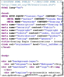
One day while taking a pre-employment program for people with disabilities back in 1996, the computer instructor introduced me to HTML — the computer language used for developing websites — as a way to keep me busy and suitably challenged. I absorbed the material like a sponge and then asked for more. I soon realized that, even though the medical professionals labeled me as functionally non-verbal, I now had a way to communicate with the world (or, at least with those who had internet access). How liberating!

A couple of years later, while working at my one and only J O B, I stumbled across the concept of web accessibility. Like the brick n mortar world, websites create obstacles for people with disabilities, particularly for those using assistive technology. Having learned the basics of the screen reader JAWS and screen magnification software ZoomText for a previous project and feeling limited and disoriented using the technology, I appreciated some of the barriers people with sight impairments may face when navigating the web.

I discovered the World Wide Web Consortium’s (W3C) Web Accessibility Initiative and the then new Web Content Accessibility Guidelines 1.0. I took a few online course through Equal Access to Software and Information (EASI) and joined the Web Accessibility In Mind (WebAIM) forum. Essentially, I soaked up everything I could about making websites accessible for people with disabilities; all kinds of disabilities.

I had been interested in physical accessibility and possibly parlaying that into some kind of consultancy, but traveling around, measuring the width of doorways and the height of grab bars didn’t seem a realistic career move. On the other hand, applying similar accessibility guidelines to websites from the comforts of my own home definitely had potential.

Accessible online communications became my business idea when I entered the Self-Employment Program. As the program came to an end, I landed my first paying gig: to develop guidelines for choosing colour schemes readable by individuals with colour blindness for a now defunct dot com company that was designing the provincial government’s website. I had no knowledge of colour blindness, and the nifty colour contrast analyzing tools didn’t exist back in the late 90s.

As I began digging into the issue, I discovered that little research had been done on it at that time. After asking questions via email of various people in the field, I developed guidelines for choosing colour schemes for people with colour blindness. The next project was to actually choose several colour schemes, which were then implemented on the Government of British Columbia’s website. That was quite a “heady” experience to visit the provincial government’s site and see my colour choices being used. I had accomplished something and had made a difference for those people who have trouble distinguishing different colours.

Several other gigs came along the way including writing the Simplified Web Accessibility Guide and co-writing its companion Accessible Online Labour Market Information: A Guide for Developers. I conducted several Web Accessibility Audits for various organizations and wrote several articles on web accessibility issues, some of which are listed in my virtual portfolio.

Over time websites changed and other programming languages were added to the mix. I felt like this red-headed chick wasn’t geeky enough to keep up with the pace of change. Although I was still passionate about making websites accessible so that people with disabilities could use and benefit from the web, I was less and less confident that I could provide clients with the depth of expertise they required and that one day I would be “found out”.

In my autobiography I’ll Do It Myself, I even shared:

Although I have done some interesting work and have become somewhat known in the web accessibility field, I don’t think I have yet hit my full potential. Because the work has been fairly sporadic, I feel it is time to explore other opportunities.

I then discovered blogging and set to learning as much as I could, only to soon realize knowing everything about this new form of communication is nearly impossible. I was quite content diving into this “passing fad” as one employment counsellor aptly called blogging. Yet, paying projects still landed in my lap without needing to chase after them. The most recent ones being a 2010 Olympic-related site and a public transit site in Toronto.

Darrell Hyatt, Lorelle VanFossen and Glenda Watson Hyatt at BlogWorld Expo in Vegas Fast forward to last September in Las Vegas where I met WordPress diva Lorelle VanFossen. Talking with her for the short time we had together, I sensed there was a great need for web accessibility within the blogging community. Individuals are attracted to blogging because it is a relatively easy way to share their stories and knowledge and to build a community of like-minded people. However, because many bloggers come to blogging with minimal, if any, web design experience, they are doing small things that unintentionally exclude individuals from their blogs; things that can easily be rectified.

Over the past few weeks I have decided to — rather than resisting the frequent pulls back into the web accessibility field — embrace those pulls and to share what I do know about web accessibility with fellow bloggers to build an accessible, inclusive blogosphere. To this end, I have several exciting plans to serve web accessibility to bloggers in 2009. My challenge will be serving it in a relevant and not-too-technical way. Stay tuned!

If you enjoyed this post, consider buying me a chai tea latte. Thanks kindly.

Random Posts

What is in a word? The evolution of disability language

Filed under: Accessibility 100,Blog Accessibility — by at 3:39 pm on Tuesday, June 24, 2008

Accessibility 100

Cripple. Handicapped. Disabled. Physically challenged. Person with a disability. It doesn’t really matter what term is used, does it? After all, is not a rose by any other name still a rose?

Anthropologist Bronislaw Malinowski suggested that “language and culture are indivisible, our language is our culture and how we use it reflects on our culture.” (Quoted from Susan Balandin, Susan. “Transitions – A lifelong journey.” School of Communication Sciences and Disorders: The University of Sydney.) Through history, culture has dismissed, discounted, and discarded those seen as different or disabled. Preoccupied with physical perfection in ancient Greek times, infants who did not measure up were drowned in the river. In medieval times, the disabled, feeble-minded, and malformed were court jesters and exhibitions at freak shows — things to be laughed at, ridiculed, and feared. More recently, the disabled were the first group to be murdered by the Nazis.

An indicator of a society’s regard for the disabled lays in the terms used to label them. For example in English, invalid means “not valid” or “not acceptable.” Handicap conjures up an image of someone on the street corner with “cap in hand,” begging for handouts and charity. These labels degrade individuals by focusing on their differences or incapabilities, rather than on the individuals themselves. Labels link individuals to stereotypes, and often trump other indicators of identity. People use labels as a form of mental shorthand, for example, the disabled, the homeless, single-parents, and so on.

Until recently, the prevalent model of disability has been the medical model in which the disabled person is seen as the problem: “We are to be adapted to fit into the world as it is.” In this model, terms frequently used include confined to a wheelchair, housebound, suffers from, stricken with, needs help, needs a cure, can’t walk, can’t talk. Usually the focus is on the impairment, rather than the needs of the individual. This language emphasizes dependency, pity, fear and patronizing attitudes and reinforces negative stereotypes of disabled people. In this model, “most disablement is created by oppressive social systems.”

In the late 1980s, largely influenced by people with disabilities themselves who argued that disability is a socially constructed concept and society itself creates the disability, there was a shift from the medical model to the social model. In this model, prejudice, discrimination, and inaccessible environments are the disabling factors, rather than the medical conditions.

The social model of disability highlights the use of language to disempower, as the medical profession and government imposed limiting and negative labels. This type of language is used as a way to control, dominate, and subtly or blatantly discriminate. This model gave way to the empowerment of people with disabilities through the development of a vigorous disabled identity and self-advocacy movement.

Then, language around disability began to change:

“.…we are not ‘the disabled.’ We are disabled people, or even people with disabilities. It is important that we do not allow ourselves to be dismissed as if we all come under this one great metaphysical category ‘the disabled.’ The effect of this is a depersonalization, a sweeping dismissal of our individuality, and a denial of our right to be seen as people with our own uniqueness, rather than as the anonymous constituents of a category or group.”

For the first time in history, people with disabilities were finding their voice in determining which terms would define them. The result was a widespread social realization that the disabled population is not a homogenous group, but rather a group of individuals often lumped together—as many stereotyped groups are—despite differences in experiences, beliefs, needs, and goals.

Society no longer knew what to call these newly empowered people. Not wanting to upset or offend them, society grappled for more socially acceptable terminology: physically challenged, visually impaired, differently abled, disAbled, and so on. Canadian songwriter Jane Field expressed this sentiment in The Fishing is Free:

No one knows just what to call us
which label should befall us,
And they’re some dandy terms from which to choose.
My favourite’s “wheelchair-bound” ‘cause it has a
bondage sound.
Oh it’s fun to guess what term they’re going to use.

Although the terms used to refer to people with disabilities are evolving, the language used to describe their experiences seem to be still somewhat medicalized. Able-bodied individuals exercise, workout, and have personal fitness trainers, while individuals with disabilities get rehab, therapy, and have physiotherapists. Able-bodied children take music lessons, children with disabilities receive music therapy. Able-bodied children do swimming lessons, children with disabilities get hydrotherapy. Such language still implies a sense of dependency and inferiority; a sense that the experiences are happening to the individual, rather than the individual being actively involved.

There is still some distance to go before people with disabilities are acknowledged as equals in society. The use of language and choice of words go a long ways in empowering and liberating, and thus, creating equality. For example, one wonders if the labels Olympians and Paralympians are viewed equal, as having the same high-quality of athleticism, determination, and commitment. Is this differentiation between athletes necessary? What purpose does this distinction serve? What stereotypes are reinforced?

Words can hurt or they can heal; they can disempower or empower; they can reinforce negative stereotypes or enlighten. Consider the language you use everyday. Does it convey the right message?

Empower Your Words

When communicating, choice of words can be quite empowering and liberating.

Words like gimp, cripple, and handicapped convey a different image than a person with a disability, a man with multiple sclerosis, or a businesswoman with cerebral palsy.

If you are unsure of what terminology is appropriate, keep these three simple tips in mind:

  1. Put people first, not their disability.
  2. Individuals with disabilities have different preferences regarding terminology. To ease awkward situations, simply ask the individual what he or she prefers — if such terminology is even necessary in the situation.
  3. Remember, we all have names. If the particular situation does not require disability-related terminology, simply use our names, please.

The key is to speak to and refer to people — all people — in a respectful manner.

(Originally written for SPARC BC News, Fall 2005.)


Accessibility 100 is a series of 100 easy-to-implement, free and inexpensive tips for improving accessibility for people with disabilities. This is a community project. Feel free to leave your comments, questions and ideas for future Accessibility 100 posts.

Get the entire series by subscribing to this blog by filling in the form in the upper right corner or by subscribing to the RSS feed.

If you enjoyed this post, consider buying me a chai tea latte. Thanks kindly.

Related Posts

5 Ways to Increase the Accessibility of Blogs

Filed under: Accessibility 100,Blog Accessibility,Blogging,Living with a disability — by at 1:15 am on Thursday, June 5, 2008

Accessibility 100

Blogs create a way for people to share their thoughts, pass on information and connect with others from around the world. Blogs provide countless individuals with a door to the world. However, for many individuals, blogs slam shut that door by creating as much of a barrier as stairs do for wheelchair users in the brick-n-mortar world.

Within the confines of their blogging platform, there are ways bloggers can increase accessibility for people with some kinds of disabilities.

1. Provide ALT attributes for all images

Images present problems for people with sight impairments using screen readers – software that reads aloud what is displayed on the computer screen. This technology cannot read content presented in an image or graphic format. Also, individuals with older computers or slow Internet connections may surf with image loading turned off and will miss information presented visually.

The simple solution is providing text equivalents for all images and graphics. In HTML, this is the ALT attribute. The code for inserting an image would look like:

<…img src=”http://www.xxx.com/logo.jpg” alt=”Accessibility 100″ />

Individuals not able to see the image would hear or read “Accessibility 100”. They receive equivalent information.

In WordPress (version 2.5.1), when using the “Add an image” feature, filling in the caption field provides the ALT attribute:


Screen shot of the “Add an image” dialogue box

Other blogging platforms will vary in how the ALT attribute is inserted. For bloggers comfortable with HTML, the platform may allow them to insert the attribute manually.

When writing ALT text, consider:

  • ALT text must communicate the purpose of a graphic accurately and succinctly.
  • the length of ALT in relation to image size (rule of thumb: 150 characters maximum),
  • if the image is purely eye candy, in which case the null ALT is appropriate. Without an ALT present, even a null one, an individual using a screen reader would hear “image”.

Not using images is not a solution. Images can increase comprehension and usability for others.

2. Make hypertext informative

Like sighted individuals, people using screen readers often scan a webpage for hypertext links that may interest them. Links like “click here” or “more” make no sense when read out of context.

To increase the accessibility of your blog, make hypertext links informative when read out of context, whether they are on their own or as part of a sequence of links. Make link text succinct.

For example, instead of:

Listen in on the interview here.

Try:

Listen to the interview.

Instead of:

…running two Group Research projects… (where each hyperlinked word points to a separate link)

Try:

…running the Internet Marketing Group Research Project and the Community Building Group Research Project

3. Maximize colour contrast

Screen shot demonstrating poor colour contrast

Blogs entails countless hours of reading. Enhance readability by maximizing contrast between text and background colours.

Consider these suggestions when choosing colour schemes:

  • Black on white is the most legible; white on black is reasonably legible; other colours on black are less legible.
  • Mixing yellow and black is fairly legible.
  • If using red or green text, make it large and bold enough to be legible in yellow.
  • Black on red and black on green are not legible, as some people will see them as black on black.
  • Combining blue and black is legible enough as long as it is not used for fine detail (e.g., paragraph text).
  • Combinations such as red-blue, green-yellow, green-white, green-gray are poor.

Colour blindness and the web will be discussed further in a future Accessibility 100 post.

4. Provide text transcripts

Audio and video add another dimension to blogs. These mediums benefit individuals with some kinds of disabilities, such as learning disabilities or cognitive impairments, who find reading long pieces of text difficult and laborious.

However, for individuals who are Deaf or hard of hearing and those who don’t understand the speaker’s accent (we all have accents!), this content is inaccessible to them. (Also, audio content is not yet searchable by search engines.)

The solution is to provide a transcript for all audio and captioning for video. Darrell Hyatt does an excellent job of providing transcripts for his podcasts. (Perhaps, in a future podcast, he’ll describe his process for using the voice recognition software Dragon Naturally Speaking for creating the transcripts.)

5. Avoid CAPTCHAs

Bloggers are inundated with spam comments. CAPTCHAs – Completely Automated Public Turing test to tell Computers and Humans Apart – are frequently used to weed out spambot comments from human comments.

a screen shot of a CAPTCHA

However, because CAPTCHAs are typically images of distorted characters, this information is not accessible to screen readers, leaving people who are blind unable to post a comment. As Darrell Shandrow, a screen reader user, said visual CAPTCHAs are “no blind people allowed” signs.

CAPTCHAs do not keep out only people who are blind. With the distortion of characters or extraneous markings, people with learning disabilities, particularly dyslexia, can have difficulty deciphering what the actual characters are. Likewise, with poor colour contrast, those individuals with colour blindness or low vision can also have difficulty getting past the CAPTCHA step.

One solution is to a combination of visual and audio CAPTCHAs. But, then people who are deaf-blind are excluded.

Avoid using CAPTCHAs, where possible, to moderate blog comments. Instead, use Askimet or other spam filters to control that unwanted spam. Make it as easy as possible to participate in your blog’s community.

Additional resources

For more information on web accessibility, check out these resources:


Accessibility 100 is a series of 100 easy-to-implement, free and inexpensive tips for improving accessibility for people with disabilities. This is a community project. Feel free to leave your comments, questions and ideas for future Accessibility 100 posts.

Get the entire series by subscribing to this blog by filling in the form in the upper right corner or by subscribing to the RSS feed.

If you enjoyed this post, consider buying me a chai tea latte. Thanks kindly.

Related Posts

« Previous Page