Do It Myself Blog – Glenda Watson Hyatt

Motivational Speaker

WordPress 2.7: A Brief Accessibility Review

Filed under: Blog Accessibility,Blogging — by at 10:52 pm on Wednesday, January 14, 2009

The past couple of weeks, Darrell and I have been giving his website an extreme makeover (no link because it isn’t quite ready). We have been using WordPress 2.7, which has given me the opportunity to get a feel for it before upgrading WordPress on my own blog.

In the short time I have been using the latest version of WordPress, I have discovered a few issues that can easily be remedied to further increase the accessibility of the most popular blogging platform. 

Colour Contrast

After the initial disoriented feeling of a completely redesigned dashboard (main controls page), the first thing that struck me was the colours. They are rather subdued, without much distinction.

Pulling out the colour contrast analyzer on the nifty Web Accessibility Toolbar, I tested several of the colour combinations on the page. Some did not pass the contrast test necessary for enhancing readability.

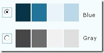
Samples of the colour combinations used in WordPress 2.7

With some digging, I found the option for changing the colour scheme (Users > Your Profile > Personal Options):

WordPress 2.7 offers two colour schemes - blue and gray

Switching to the blue scheme does more easily distinguish the various sections. However, some of the colour combinations still do not maximize colour contrast to enhance readability.

With such a customizable dashboard, the option for bloggers to choose their own colour scheme to suit their particular needs and tastes would further increase and improve the customization of WordPress.

Keyboard Shortcuts

Poking around further, I discovered keyboard shortcuts had been added to the visual editor used for writing posts. For someone who relies on the keyboard, these shortcuts makes life easier.

Searching the help, I could not find a list of available keyboard shortcuts, except the ones for comment moderation. Unless I have missed something, the only way to discover the shortcuts is to hover the mouse over editor buttons, which defeats the whole purpose of keyboard shortcuts.

The keyboard shortcut for bold

The keyboard shortcut for Bold is given as Ctrl / Alt + Shift + B. I have never seen a “/” in a keyboard shortcut before. What does it mean? Do I actually hit “/”? Does it mean either the Ctrl or the Alt? I could not figure it out for the life of me. Out of sheer frustration, I tried the Bold shortcut that most other PC programs use: Ctrl + B. It worked! The standard Ctrl + I worked for Italic.

No keyboard shortcut shown for underline buttonAlthough a keyboard shortcut is strangely not given for Underline, the standard shortcut does work: Ctrl + U.

A list of functioning keyboard shortcuts available in WordPress 2.7 would be helpful. Even sweeter would be if that list was visible while writing a post.

Images

After upgrading my blog to WordPress 2.5.1 a while ago and being baffled by the “Add an Image” dialog box, I was hoping the 2.7 version would be more straightforward. No such luck. They are essentially the same.

When I uploaded an image for test purposes, the 2.7 version showed the full image (rather than a scaled size, completely messing up the rest of the box:
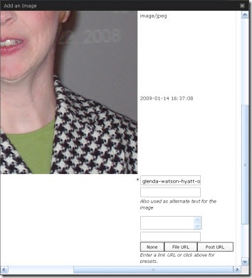
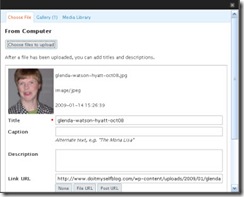
A screen shot of a portion of the "Add an Image" dialog box

Screen shot of the "Add an Image" dialog box in WordPress 2.5.1 Using the 2.5.1 version for guidance, I am assuming the three text boxes are for entering the Title, Caption and Description. From here, the Title, whose default is the filename, becomes the image title; the Caption becomes the alterative text <ALT>; and the Description seems to disappear and is pointless. Confused yet? I am!

The code comes out as:

<img src=”http://enablingabilities.com/wp-content/uploads/2009/01/glenda-watson-hyatt-oct08.jpg” alt=”Glenda Watson Hyatt” title=”glenda-watson-hyatt-oct08″ class=”alignleft size-full wp-image-79″ />

The thing that really bugs me is, in the “Add an Image” dialog box, the Title is marked as a required field, not the Caption that becomes the ALT: a crucial piece in web accessibility.

It is the ALT text that enables an individual using a text-to-speech screen reader to hear what an image is; not the TITLE. It is the ALT text that appears on the webpage when an image does not load; not the TITLE.

To encourage bloggers to provide an ALT for every Image, make the Caption a required field; better yet, name the field what it is – the Alternative Text.

With these and other changes, Matt Mullenweg and his development team will continue strengthening WordPress’ commitment to accessibility.

If you enjoyed this post, consider buying me a chai tea latte. Thanks kindly.
Random Posts

Trackbacks

  1. User-Centered Design and Web Accessibility Blog - AniktoBlog » Blog Archive » WordPress Accessibility
  2. Do It Myself Blog - Glenda Watson Hyatt » WordPress vs Live Writer: The Image Smackdown

13 Comments »

Comment by Ricky Buchanan

January 14, 2009 @ 11:43 pm

The same not-finished keyboard abbreviations show up when using Mac OS X too, where they’re even more wrong – the keyboard shortcut for bold for example is command-b under Mac, and it works when I tried it, but it still has the same weird tooltip as you see under Windows. The keyboard shortcuts which just have “alt+shift” and a letter don’t seem to work under Mac, or I couldn’t figure out how to make them work.

On the plus side for accessibility 2.7 seems to have more features available through the API. This means we can use a program of our choice under our own operating system to write posts and upload them automatically with categories, tags, etc. and also to moderate comments. I use MarsEdit for OS X to do this for all my posts. There’s still some stupid limitations though – you can’t use an offline editor to write pages for example!

It’s free software which means the parts that get developed are the parts which somebody volunteers to spend their time and energy on. That’s generally things they’re interested in the most and, sadly, there aren’t many other geeks out there who have accessibility as a major interest 🙁 Hopefully that’ll change!

Comment by Iain Broome

January 16, 2009 @ 1:57 am

Great post and I thought eaxctly the same thing about the colour contrast when I first installed 2.7.

It seems that there’s still a long way to go with WordPress and accessibility. I too find the image adding/editing process confusing. For instance, I want my images to have alt text (obviously) but I don’t want a caption to appear beneath my picture. This should be an option without having to make sure the necessary code is there/removed.

That said, yes, it is free software!

Comment by Fabio Trigo

January 18, 2009 @ 11:53 am

Glenda, i don´t know if you can translate all my words in my blog and discover my job´s propose. I´m a brazilian wedding planner and i created a wedding ideas´ blog to help all brides of my country to plan and organize your weddings

It´s a pleasure to receive your comment on my blog. You are an example of life and i´m honored to know your history and can share its to my readers.

My best wishes to you! (sorry for any mistake in my writing… :D).

Fabio

Comment by Jan Karlsbjerg

January 19, 2009 @ 10:09 pm

This is a great, specialized review, Glenda! I’m sure the WordPress folks would like a hint about it.

I know they take usability very seriously (the UI changes they’ve made are a result of actual user testing). Also they have some big corporate customers, and accessibility (ADA) gets to be more of a sore point the bigger the customer (especially if you sell to the public sector).

Comment by Jessica

January 22, 2009 @ 1:30 pm

Awesome exploration of WP 2.7, Glenda! For the images, I think if you use the browser upload instead of the flash upload, it chops the picture to a small size (so, it’s not a proper thumbnail and may make the photo unrecognizable, but at least it doesn’t muck up what the boxes are for–that’s what it does on my screen, anyway).

Comment by Virginia

January 24, 2009 @ 6:51 am

I found your blog via All Access Blogging. This is the first article I read. I am delighted to finally find you and will be a regular reader. I’m glad to see what you had to say about the way WordPress 2.7 asks for image titles and captions. It is completely messed up and does not make it clear what is going to be the alt text. Hopefully they will listen to these complaints and do something more compliant with standards in the future.

Comment by Andrew

January 26, 2009 @ 2:30 am

Very nice review. Just a few points: there’s help for the editor (the last button on the second row). All keyboard shortcuts are listed there, same as in 2.5. There are quite a few of them and the keys are slightly different for the different operating systems.

It would probably be better if you could use a newer browser. As far as I can tell by looking at the screenshots, you’re using Internet Explorer 6 which is very old and has been unsupported by it’s creators for a long time. Upgrading to Internet Explorer 7 or switching to FireFox if possible would make everything look and work better.

Comment by Tim OBrien

March 1, 2009 @ 9:15 am

Just found this post via Hey Automattic and Six Apart, help us build an accessible blogosphere at All Acces Blogging. Good reading. The WordPress team ought to but together an accessibility team with our input.

On the admin color scheme, there is a plugin called Easy Access Color Scheme. I use it and am developing a custom color scheme that is high contrast. EACS’ developer is currently helping me finish the theme as I do not know enough style sheet coding. We will be making it available on my blog by the end of the week. I have a page dedicated to my posts on access in blogs and blogging.

The image tagging process is definitely confusing. As I do not use a screen reader, I do not know how my images come across. Which attributes do screen readers hear and what does WordPress call them? Hey Automattic and Six Apart, help us build an accessible blogosphere has some answers.

Comment by William Lawrence

March 9, 2009 @ 6:55 am

I’m very excited to read your post and how you’ve taken the time to review the accessibility of WordPress. If I may, I’d like to add to the conversation and if I provide too many links in this comment, please feel free to modify.

When inserting an image with WordPress all that is required is the Title which then gets used for the title and alt attribute of the image element. This is kind of good, because it kind of meets ATAG requirements, however because the content in the title and alt attributes are duplicated, this is inappropriate as it duplicates the context of the content. In addition, if one does not change the title of the image from an improper file name, the meaning is lost.

When one adds caption text, this additional text is placed next to the image and alt attribute of the image, while the title attribute of the image remains the title, or filename, of the image. This is kind of okay because now the image element no longer has duplicate content for these attribute, however the alternative text for the image now repeats what duplicated in the content of the article: inappropriate and repetitive.

Meanwhile, the description text is used as content for Attachment post page if one chooses to publish each image as a separate attachment post. More information can be found on their Codex for Using Image and File Attachments.

WordPress, and other CMSs, is a Web content authoring tool. Therefore it’s important to assess them accordingly against the Authoring Tool Accessibility Guidelines 1.0 (ATAG). This has been done once before, that I know of, three years ago for WordPress 2.01 Alpha. What ATAG says is basically that authoring tools must not only be accessible but support non-expert end users in authoring accessible content

In other news, ATAG is being updated to ATAG 2.0 to be more in sync with WCAG 2.0 and provide a broader coverage to web-based interfaces such as social networking sites that allow users to add and edit Web content.

Anyway, that’s all I’m going to say about this, for now. Again, I’m glad to see someone writing about this important and fun stuff.

Comment by Glenda

March 9, 2009 @ 2:23 pm

William, thank you for your detailed comment. Very helpful. My next web accessibility post will be comparing the code produced by WordPress versus Live Writer – the kind of question that keeps me awake at night! I will refer to your points.

An excellent point about testing WordPress against ATAG. I totally agree!

Comment by Franso

July 8, 2009 @ 12:55 pm

Good post about wordpress

RSS feed for comments on this post. TrackBack URI

Leave a comment

XHTML: You can use these tags: <a href="" title=""> <abbr title=""> <acronym title=""> <b> <blockquote cite=""> <cite> <code> <del datetime=""> <em> <i> <q cite=""> <s> <strike> <strong>